Shine on you crazy diagram – part 1 …
I missed the opportunity to celebrate my 888th post with an insightful and funny text of sort. The moment just flicked by, I guess that’s a good sign for being in the flow. But somehow I feel like I owe you a “funny post” ….
And too much good coffee on a BarCamp saturday morning makes me think of odd titles, all the while this isn’t as crazy as it seems. Bear with me and check out some of the diagrams that crossed my path lately:
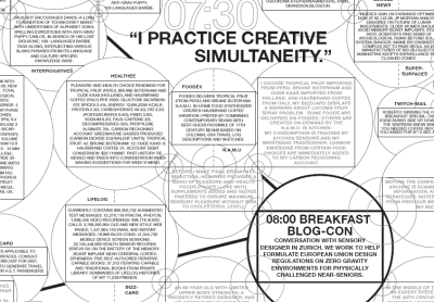
Several weeks ago and via IFTF’s Future Now I learned of Tom Klinkowstein and Irene Pereyra’s exhibit of a wall-sized diagram called “A Day in the Life of a Networked Designer’s, 2030” at Pratt Institute’s Manhattan center:
Then there’s this linking open data (LOD) cloud diagram presenting the current class-level structure within LOD datasets. Pretty impressive, huh?

Then via Daily Kos this gem: Sarah Palin Debate Flow Chart:

Now’s all clear and transparent, huh?
So, you need more irresistible graphics? Stand by, a follow up post is in the making.