Shine on you crazy diagram – part 3
It’s funny and instructive, my little series on visualizations that are unusual, doing it plain wrong or are at least somehow awkward (see part 1 and part 2 for more goodies).
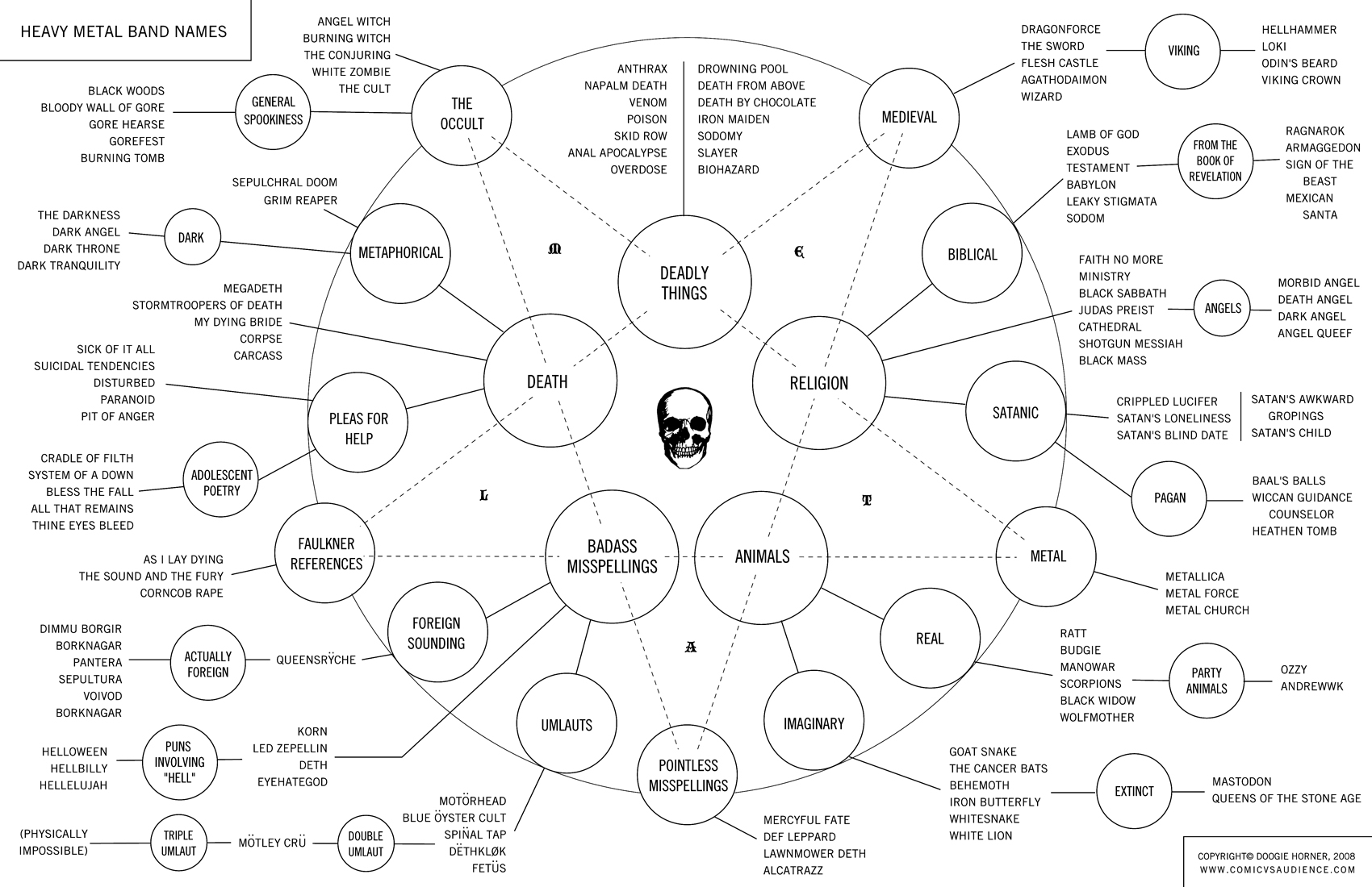
Via Boing Boing, Neatorama, Buzzfeed, I am Jeriko and Polkarobot (internet memes they travel fast and far …) the Heavy Metal Band Names Flowchart:
Plain black and white takes us so far, huh? Now, let’s see, reduced graphic vocabulary in a colourful subject, found via MaisonBisson and you may click on through):
Some colours are nice, see e.g. the Milky Way as subway map:
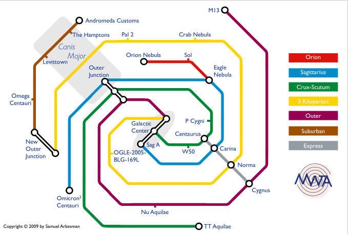
Or this neat visualization of the industrial-economic complex, really nice:
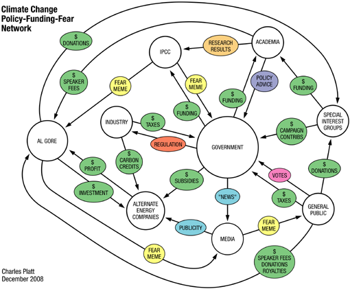
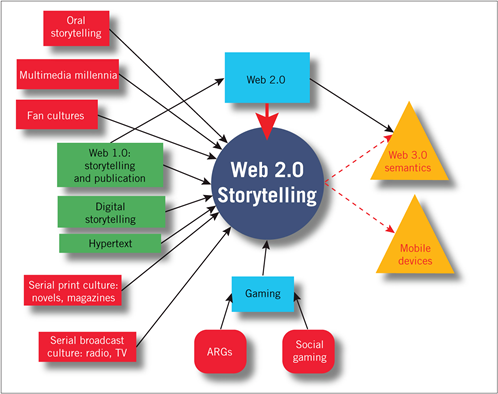
Notice the green money studs? Same green in the little gem I found in the eduFutureBlog (alas, can’t really explain this, but I like the colours so much):
Ah, science and the internets – a complimentary relation. So, and again in the edufuture-Blog, I found this neat visualization of the global Net – an Internet Map for 2009 and for you. Granted, this is a complicated mesh of networks …:

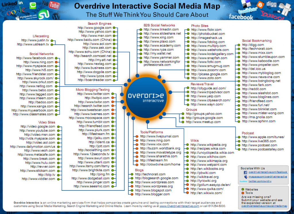
At last, found via Martin Ebner, an Interactive Social Media Map (pdf) (don’t use this for your internet ventures, some pifalls and weird classifications are in there and I wouldn’t recommend to use ma.gnolia for your social bookmarking needs, at least for some time):
![flow_sex [Converted]](http://www.martin-koser.de/BMID/wp-content/uploads/2821834869_25b354a9d4_o.jpg)
